

Simplexion
Building the foundation of a refreshingly simple take on skincare.


After struggling to find a beauty regimen that wasn’t overcomplicated or required numerous products, Nina and Heather Binnie decided to launch their own skincare line. One that simplified their daily routine without compromising on quality.
We rooted the brand in the notion that less is more and created a system grounded in the idea of simplicity and harmony. Through rounded typography and a soothing color palette, we designed a brand system that comes together to challenge common beauty conventions and express the benefits that come with simplifying your routine.
Simplexion makes skincare easy. For the brand name, we took the common phrase “complexion” and replaced “complex” with “simple." A custom lowercase font reflects the refined, elegant, and clean nature of the brand. Two graphic S’s form a nostalgic pinwheel for the brand’s mark, representative of simpler times. Elements of the mark are used throughout the digital experience and packaging.
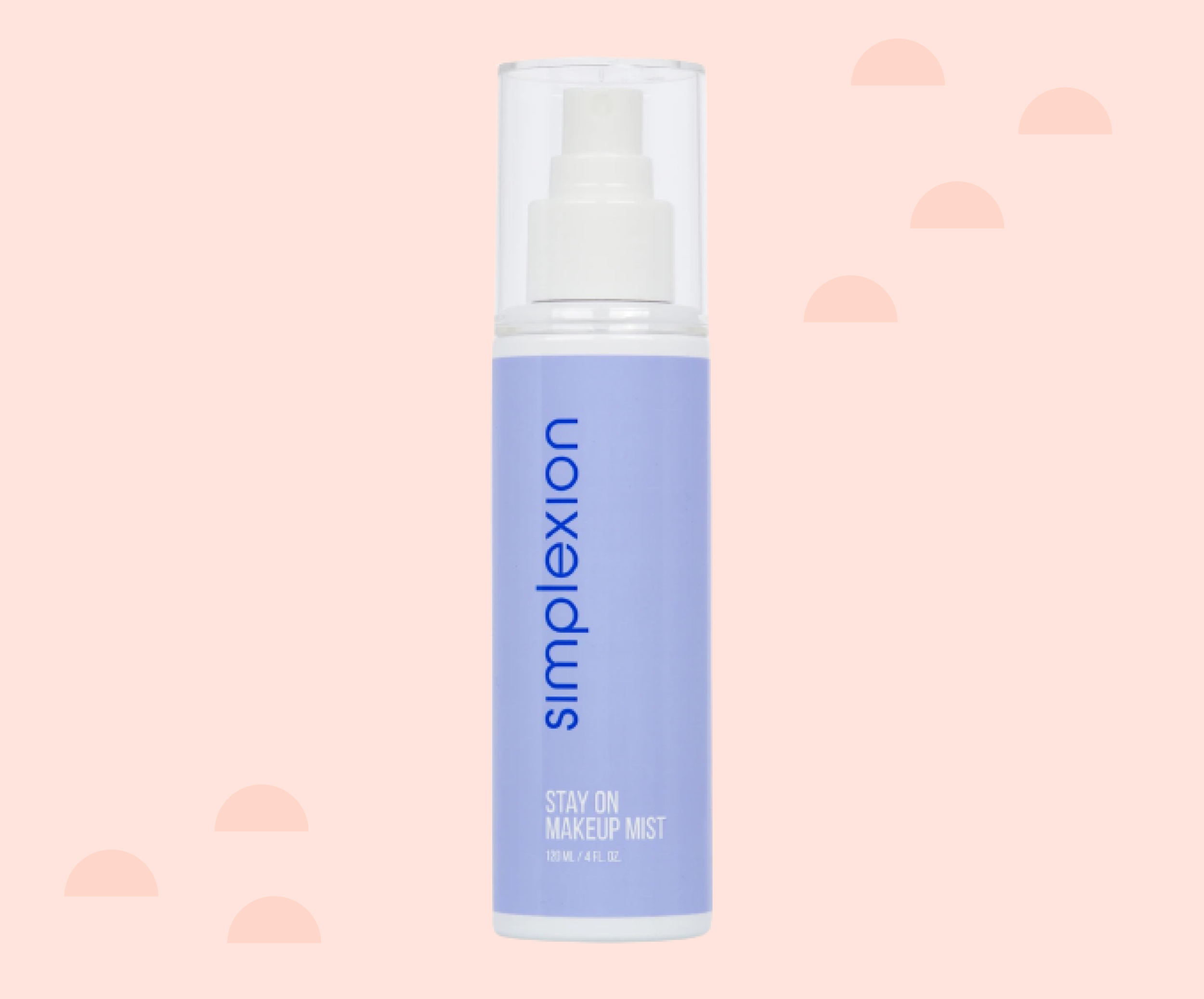
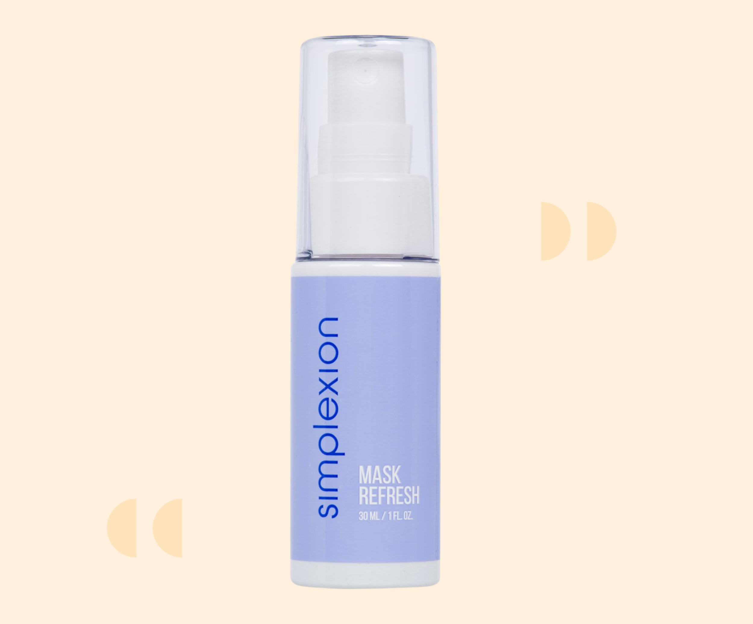
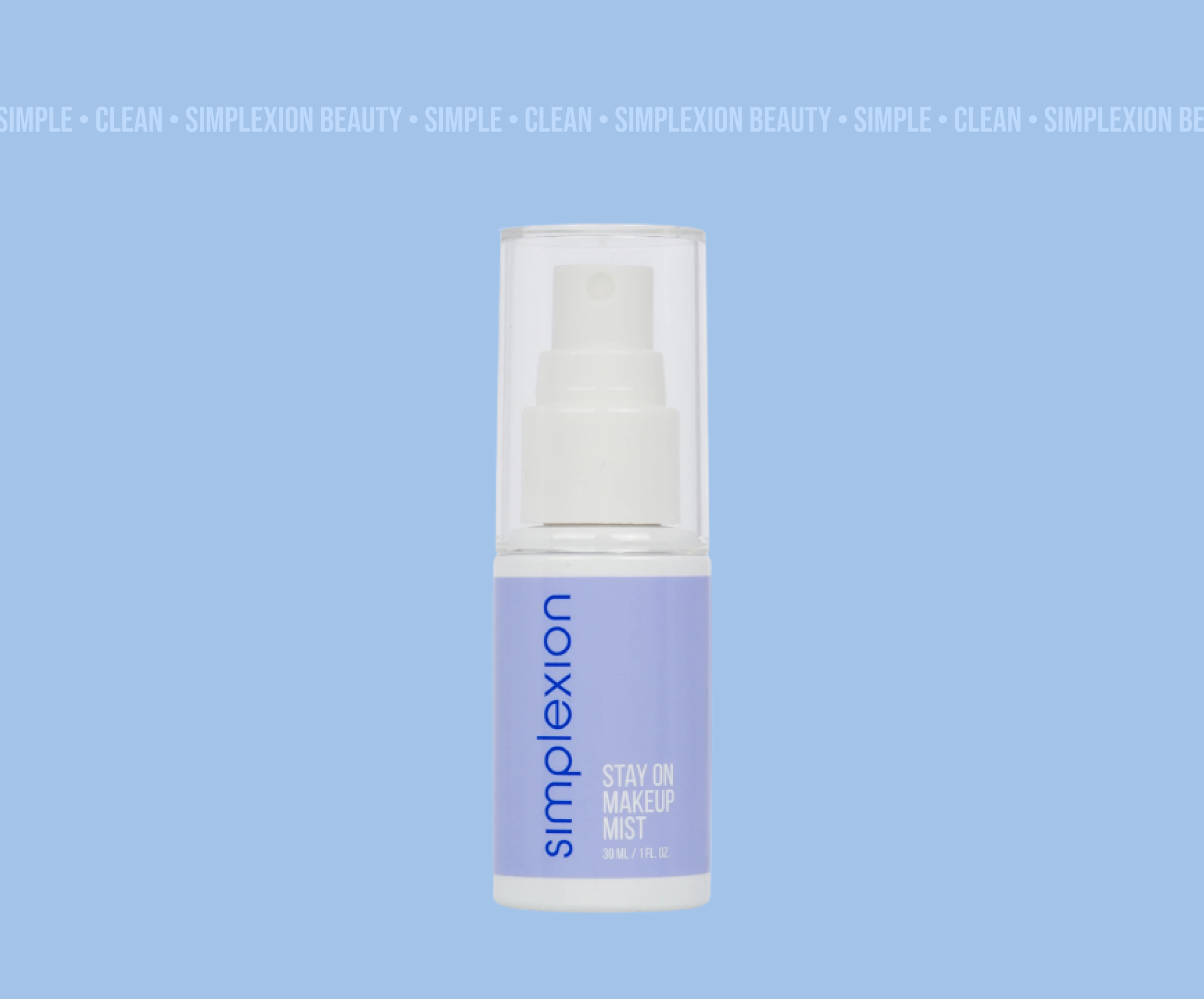
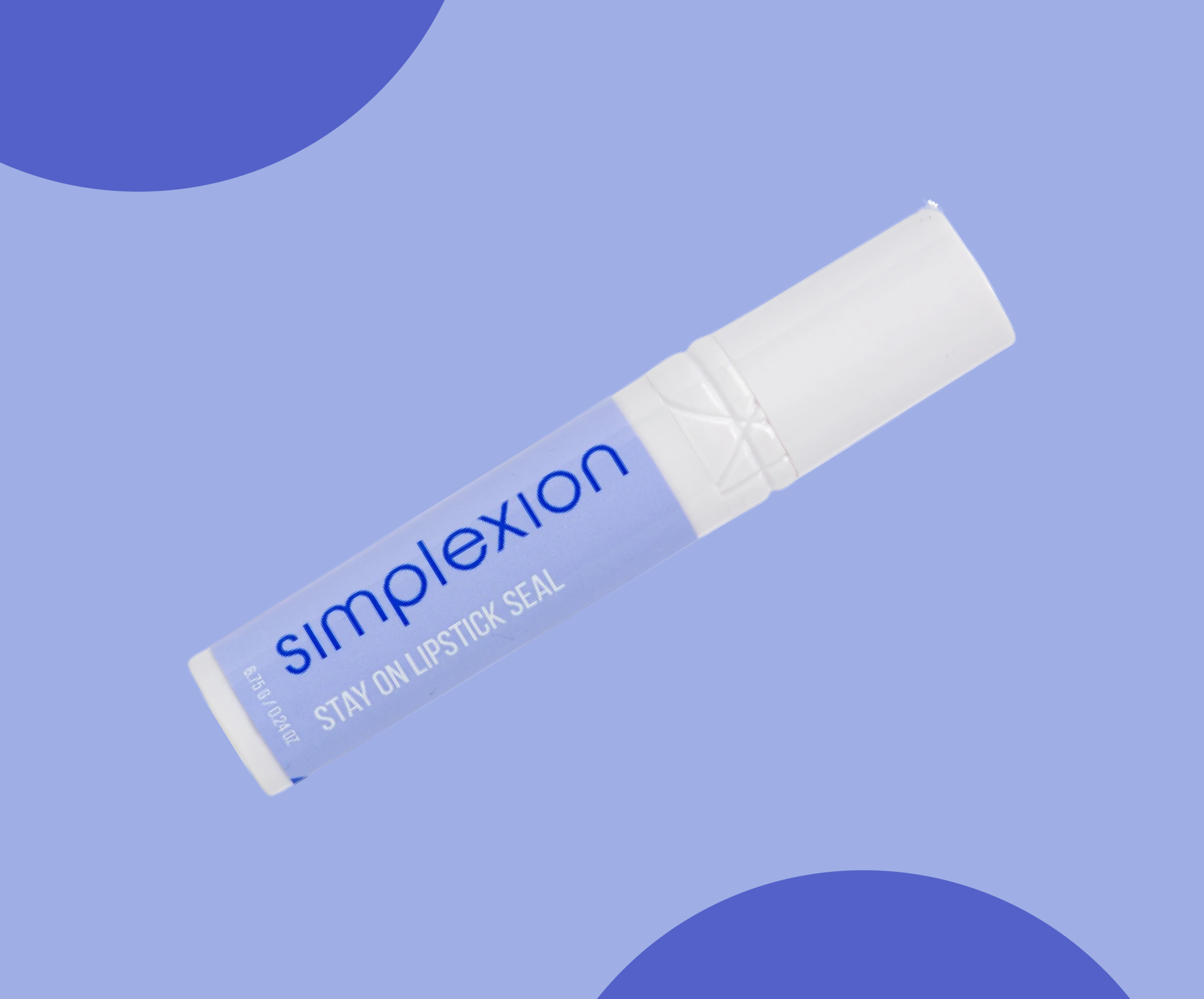
The first three products were designed in 2020 to tackle the unique beauty challenges presented by face masks. With the Stay On line, your makeup no longer smudges or rubs off under your face covering.
Visit the Site →
Brand naming
Brand identity
Brand messaging
Product naming
Logo creation
Label design